
"Smart Growth" (henceforth "SG") is a grossly misused term these days. Almost exclusively used to describe slightly modified suburban development -- moderately smaller lots, more narrow streets, excessive subsidies, "walkable" "communities", and those detestable
Towne Centres all come to mind -- the term is a bit of old fashioned semantic smoke and mirrors. The promise is that we can continue to build much as we have for the past fifty years if we consume a couple less farms, or if we move things just a little closer together. Of course, the fact is that these minor changes are producing minor results.
The danger here is twofold: on the one hand, "SG" advocates and the people who choose to (and can afford to) live in "SG" developments pat themselves on the back and insist that they are doing their part to save the world from global warming, when in fact they have made very little difference (and are probably likely to make it up through other small indulgences with which they congratulate themselves for being such good citizens); even more foreboding is the fact that the failure of these not-so-smart "SG" projects provides the pro-sprawl, anti-transit crowd with ample ammo in their arguments against not only "SG", but cities and urbanism in general.
Case in point: a recent article by Wendell Cox of Demographia for the Toronto Star highlights the inability of "SG" initiatives, with their emphasis on (barely) higher density and driving less (sometimes), to curb greenhouse gasses. This is no surprise for reasons discussed above. But the article also cites a University of Sydney study that makes the deceptive argument that dense, transit-linked city neighborhoods produce higher levels of greenhouse gasses per capita than sprawling suburbs.
If this seems counterintuitive, that's probably because the findings are slanted. It is true that Inner Sydney has the highest per capita outpot of GHG, but there is no mention of the fact that a huge chunk of this area is taken up by office towers, which consume massive amounts of energy for heating and cooling, thousands of acres of fluorescent lighting, and other energy-consuming systems that often continue running long after employees have left for the night. Being the central business district, Inner Sydney is also the destination of much of the auto traffic that originates in the surrounding sprawl. Outside the CBD, other neighborhoods include other offices and large tracts of industrial land (and factories are often very large producers of GHGs) that are much less likely to take up space in more far-flung areas.
Of course, 43.3% of the eco-footprint for the average New South Wales resident is created by the hugely disproportionate costs for importing food. This gets at the true heart of the problem facing cities and suburbs around the globe: the need to live locally. Of course, neither the pro-"SG" crowd nor its detractors talk much about that.
More on all of this "SG" business next week...
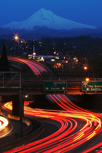
 (Photo from Flickr user pfrench99.)
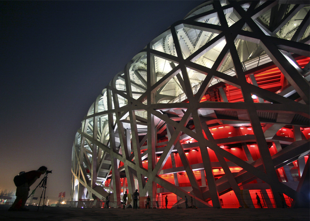
Links:
Planners denying reality (The Toronto Star)Australian Conservation Foundation's Consumption Atlas


 (74.5/120)
 (54.7/88)
 (26/42)
 (28.6/46)
 (16.8/27)
 (22.4/36)
 (22.4/36)
 (53.4/86)
 (22.4/36)
 (18.6/30)
 (20.5/33)
 (83.9/135)
 "Smart Growth" (henceforth "SG") is a grossly misused term these days. Almost exclusively used to describe slightly modified suburban development -- moderately smaller lots, more narrow streets, excessive subsidies, "walkable" "communities", and those detestable Towne Centres all come to mind -- the term is a bit of old fashioned semantic smoke and mirrors. The promise is that we can continue to build much as we have for the past fifty years if we consume a couple less farms, or if we move things just a little closer together. Of course, the fact is that these minor changes are producing minor results.
