Showing posts with label review. Show all posts

Thursday, April 23, 2009

Review: Buckminster Fuller at the MCA


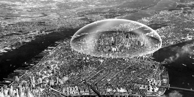
In a corner of the soaring lobby of Chicago's Museum of Contemporary Art sits an inconspicuous screen cycling though a series of quotes. "Don't fight forces," one suggests, "use them." A few seconds later: "Do more with less." And then: "Real wealth is ideas plus energy." These are the words of Buckminster Fuller, the great American thinker and designer famous for his geodesic domes and his pragmatic idealism. Fuller was a colorful man, and extraordinarily wealthy if measured by his own standard: his thoughts were abundant and bright, and his energy seemingly boundless. In the exhibit Buckminster Fuller: Starting With the Universe, the MCA has crafted an impressive overview of Fuller's life and work that brings into focus his prescient worldview and, more importantly, the thought process behind it.

It was after his failure as a businessman and the death of his daughter in 1927 that Fuller resolved to turn his life into an experiment to see how much one man could contribute to society in a lifetime, labeling himself "Guinea Pig B." The exhibit opens with several rooms filled with a diverse selection of objects that recount the beginning of this experiment. Models, drawings, maps, notebooks, and other objects show the evolution of Fuller's early work into his development of the World Game and the Dymaxion map during and after World War II.

Fuller prided himself on his comprehensive thinking; he approached each problem as part of a larger system of problems. Humanity's great challenges were all interlinked, and to consider solutions for one, it was necessary to consider the others simultaneously. Nowhere in the Starting With the Universe is Bucky's way of thinking on display more clearly than in the two rooms that detail the evolution of the Dymaxion Map into the development of the geodesic dome. It was his work on creating a map that eliminated the distortion of the planet's land masses that led to Fuller's fascination with polyhedrons. His engineer's brain latched onto the structural integrity of the icosahedron form that his map created when folded into a "globe," and by the 1950s he was working with his students at the legendary Black Mountain College in Asheville, NC, on developing the dome that would define the later part of his career.

Interestingly, it is a rather inconspicuously-placed video of Fuller at the mid-point of the exhibit that offers the clearest glimpse of how his industrious mind processed information about the world. His demonstration of how a flexible polyhedric structure shifts form is underlined by his emphasis on its uniform contraction and expansion. Throughout his life, Fuller worked on devising comprehensive solutions to myriad problems; his fascination with a flexible structure in which each part was equally responsive to all of the others is hardly inconsequential.

Beyond the geodesic dome, the maturation of which is explored in the second half of the MCA show, Bucky Fuller is arguably best remembered for his prescience. His ideas about environmentalism and the consequences of man's actions on the planet presage the contemporary Green movement by decades; he is also remembered for his early conceptualization of the internet and his musings on the growing importance of mass communications. Fuller understood everything as being part of a system, a network. In Buckminster Fuller: Starting With the Universe, the MCA has created an exhibit that presents Fuller's as a visionary worldview that remains relevant more than twenty years after the great thinker's death. Like any good museum exhibit, this one makes the visitor re-think they way that they look at the world. Bucky would be proud.

----
Buckminster Fuller: Starting With the Universe is on display at the Museum of Contemporary Art in Chicago until June 21st, 2009. For more information about the museum and its other exhibits, click here.


(Photos from ArchNewsNow, OSEarth, and PentaMil.)

Monday, December 8, 2008

The Paradox of the False Positive

An excerpt from Cory Doctorow's latest book, Little Brother:

If you ever decide to do something as stupid as build an automatic terrorism detector, here's a math lesson you need to learn first. It's called "the paradox of the false positive," and it's a doozy.

Say you have a new disease, called Super-AIDS. Only one in a million people gets Super-AIDS. You develop a test for Super-AIDS that's 99 percent accurate. I mean, 99 percent of the time, it gives the correct result -- true if the subject is infected, and false if the subject is healthy. You give the test to a million people.

One in a million people have Super-AIDS. One in a hundred people that you test will generate a "false positive" -- the test will say he has Super-AIDS even though he doesn't. That's what "99 percent accurate" means: one percent wrong.

What's one percent of one million?

1,000,000/100 = 10,000

One in a million people has Super-AIDS. If you test a million random people, you'll probably only find one case of real Super-AIDS. But your test won't identify *one* person as having Super-AIDS. It will identify *10,000* people as having it.

Your 99 percent accurate test will perform with 99.99 percent *inaccuracy*.

That's the paradox of the false positive. When you try to find something really rare, your test's accuracy has to match the rarity of the thing you're looking for. If you're trying to point at a single pixel on your screen, a sharp pencil is a good pointer: the pencil-tip is a lot smaller (more accurate) than the pixels. But a pencil-tip is no good at pointing at a single *atom* in your screen. For that, you need a pointer -- a test -- that's one atom wide or less at the tip.

This is the paradox of the false positive, and here's how it applies to terrorism:

Terrorists are really rare. In a city of twenty million like New York, there might be one or two terrorists. Maybe ten of them at the outside. 10/20,000,000 = 0.00005 percent. One twenty-thousandth of a percent.

That's pretty rare all right. Now, say you've got some software that can sift through all the bank-records, or toll-pass records, or public transit records, or phone-call records in the city and catch terrorists 99 percent of the time.

In a pool of twenty million people, a 99 percent accurate test will identify two hundred thousand people as being terrorists. But only ten of them are terrorists. To catch ten bad guys, you have to haul in and investigate two hundred thousand innocent people.

Guess what? Terrorism tests aren't anywhere *close* to 99 percent accurate. More like 60 percent accurate. Even 40 percent accurate, sometimes.

What this all meant was that the Department of Homeland Security had set itself up to fail badly. They were trying to spot incredibly rare events -- a person is a terrorist -- with inaccurate systems
.

DHS, in Doctorow's skillfully-written book (full disclosre: I'm a long-time fan) has taken over San Francisco after a pretty horrific terrorist attack, and implemented a security net so obnoxious that everyone is a suspect, turning the "innocent until proven guilty" maxim fundamental to the US justice system on its ear in the name of "protecting" the very citizens it interrogates on every corner.

As if we needed a reminder, the recent Mumbai attacks have thrust the extraordinarily rare specter of the large-scale, well-coordinated urban terror strike back into the public spotlight. Doctorow's greatest strength has always been his ability to make the future feel incredibly near; it is not even remotely difficult to imagine a scenario like the one described in LIttle Brother playing out were another major attack to strike a US city. Almost as frightening than the idea of an actual attack (or more frightening, depending on who you talk to) is the idea of what might come after. Imagine a massive citizen-tracking web, to put London's CCTV to shame, layered on top of the already overanxious contemporary cityscape, and consider the paradox of the false positive. Not pretty.

Little Brother is available for free download under Creative Commons licence right here.

Friday, February 15, 2008

WEEKEND READING: February 9-15, 2008

Good stuff, good stuff, good stuff. Enjoy some reading this weekend, folks. There's something here for everyone...

ITEM ONE: Deputydog explores Portland's Dignity Village, the "most organized shanty town on earth."

ITEM TWO: Creative class guru Richard Florida, MIT Department of Architecture head Yung Ho Chang, and Minneapolis Mayor R.T. Rybek are just a few of the experts to which Architect Magazine posed the question: "How Would You Spend $1.6 Trillion on Infrastructure in the US?"

ITEM THREE: A pleasingly astute assesment of the Gentrifyer's Guilt from the blog Believe in the Greatest City that Reads in America (which is Baltimore, apparently).

ITEM FOUR: Landscape Urbanism with a great (and well-illustrated) profile of Jean Nouvel as part of the Veg.itect series. (Also check out this review of the Worlds Away: New Suburban Landscapes exhibit, which opened this week in Minneapolis). (Photo credit)

ITEM FIVE: WorldChanging on how peak population -- and the inevitable decline to follow -- should frame the current discussion of susatinability.

ITEM SIX: Guest blogger Dave Atkins reviews Suburban Transformations over at All About Cities. Where featured a review of this book last month, and if you missed that, make sure to check out Mr. Atkins' post.

ITEM SEVEN: In case you missed it, Science just put out a special issue focusing on cities and the "urban planet" phenom.

See you Sunday for Urbanffffinds!

Thursday, January 17, 2008

Review: Suburban Transformations


I'll start this review off with an apology to PA Press, since they sent me a review copy of architect Paul Lukez' new book Suburban Transformations back in early November and I'm just getting around to actually reading and reviewing it more than two months later. There was NaNoWriMo, then there were holidays...it has been a crazy winter. And so, without further ado...

There is a lot of discussion these days, at least in architecture and planning circles, about what will happen to today's sprawling suburbs as people wake up to the fact that the current suburban model is unsustainable. There have been calls for a complete return to cities, though I think most everyone knows that this would be extremely difficult if not outright impossible. Cities have physical limits, and density becomes unhealthy after a certain point. Compare Paris to the infamous Kowloon Walled City for an exemplary contrast.

Still, it is widely assumed that the suburbs of tomorrow will look quite different from the beige, cul-de-sac draped landscapes that currently surround central cities throughout much of the developed world. While the speculation about the external changes that will force suburbs to shape-shift is frequent and varied, ideas (not to mention actual visualizations) of what these nouveau suburbs might look like are surprisingly few and far between. Suburban Transformations fills a unique gap in that regard, and the pragmatic novelty of author Paul Lukez's descriptions and images of prospective suburban densification and evolution is what makes them so very impressive.

Stylistically, Suburban Transformations is something of a hybrid; it is too colorful to be called an academic text, and yet a bit too dry to be read purely for entertainment. Still, the mix works well, with the text augmented generously with drawings and photos. The bulk of the book is spent discussing the methods Lukez envisions for changing the shape of traditional auto-centric suburbs as painlessly as possible; his process -- deemed the "Adaptive Design Process" -- is appropriately simple. It offers ways to examine and reshape suburban spaces characterized (ironically?) by their lack of character. If suburbs are to be criticized for their generic appearances, Lukez' process should conversely be commended for its ability to take these incredibly generic places and not only make sense of them, but also to make valid suggestions about how to take supposedly hollow, meaningless places and re-think the context to provide opportunities for site-specific design.

The bulk of the book focuses on a single hypothetical case study of the area around a mall in the Boston suburb of Burlington. Here, the author puts his theories into action, using everything from the topography to the noise levels to the freeway interchange -- yes, the freeway interchange -- to give texture and meaning to the site. The book suggests that Burlington's history as an important transportation route -- established first by Route 128 in the early 1900s and reinforced by the freeway in the 60s, can and should be used as a contextual element to guide the design process for transforming the site. The massive roadway is thoroughly and thoughtfully integrated into all of the adaptive designs that are envisioned during the second half of the book. In the end, the freeway itself becomes more closely related to the site; at the same time that it gives the site meaning, the reconfiguration of that site transfers increased significance to the road itself.

Further exploration of the Adaptive Design Process is helpful to understanding its versatility. As a result, Lukez also takes time at the end of the book for three shorter case studies of Amsterdam, Dedham (another Boston suburb), and Shenzhen. Illustrations are plenty and the ideas presented exciting. In fact, this is perhaps the book's greatest strength: its ability to turn a seemingly dire problem (the proliferation of soulless suburbs) into a golden opportunity. Suburban Transformations envisions the dramatic altering of the suburban landscape. And whether or not the process described in the book is ever widely used, the true value of this book is how effective it is in dramatically altering the reader's perspective.


Links:
Suburban Transformation (Powells.com)

Paul Lukez Architecture

Tuesday, November 20, 2007

National Geographic's Maps: Tools for Adventure @ the Museum of Science and Industry

If you typed the word "maps" into Google and then visited the first ten sites on the results page, you might get a good idea of what it feels like to walk through the Museum of Science and Industry's exhibit National Geographic's Maps: Tools for Adventure, which is part of the citywide Festival of Maps. That is to say: a nuanced overview of mapping technology, this is not. While the exhibit is kid-friendly, it tries a bit too hard to go after the attention deficit demographic. Thematically, the "tools for adventure" theme is the loose string that sort of ties things somewhat together, almost. In fact, between this, the City of the Future exhibit earlier this year, and the Christmas Around the World disaster that we'll discuss in a minute, I'm beginning to wonder if, perhaps, this legendary museum is just coasting on its historical reputation these days.

But, before a tangent begins, let's get back to NGM. The exhibit is, in plain terms, an awkward hybrid of a video arcade, a preschool classroom, and a museum installation. There are kiosks set up throughout several rooms, as well as a block table (a kid-friendly trick MS&I tried with City of the Future that still feels misplaced) and a large foam-block pyramid puzzle. Add to that a moon rover used for mapping Mars, a fake stargazing setup, and an airplane cockpit with plenty of buttons and levers, and you have an intellectual seizure that can even make the grown-ups a bit dizzy.

If the organization of the content is less than stellar, it should be noted that there are some interesting items on display. A portion of an old scroll map of the Mississippi River makes an early appearance, as does an early map of Disneyland (which is cooler than it sounds). But the overall effect of the topical schizophrenia is that, unfortunately, individual pieces get lost in the muddle. Even for someone used to clicking through a few hundred articles and websites a day, the wide variety of topics covered here was so overwhelming that it got downright boring halfway through. When the brain is presented with too much information, it shuts down. I shudder to think that this is the way the curators at one of the nation's most prestigious museums think that children should be taught (to be fair, the exhibit was organized by the Children's Museum of Indianapolis and the National Geographic Society, but MS&I agreed to host it).

But the real jaw-dropper of the day was not the FoM exhibit, but something tangentially related. Apparently, it is customary for the MS&I to put together a Christmas Around the World exhibit. I haven't been to the museum to see past iterations, but this year the exhibit involves Christmas trees decorated to represent "customs" from countries around the world. This provides the museum with a fabulous opportunity to combat Americans' infamously low geographic knowledge, which it squanders on an embarrassingly simplified version of global cultures.

To wit: Mexico's tree is decorated with dozens of felt-cutout Mexicans complete with sombreros and ponchos, Ireland's is dripping with kitschy shamrocks and jigging leprechauns, and there is a very purple Native American Christmas tree that's decked out in a gazillion of those hexagonal things you make out of yarn in kindergarten. Japan's and China's trees, meanwhile, are both covered in oragami (but the China tree uses fluorescent paper, so it's totally different), and (tellingly) the United States' tree is wrapped in red, white, and blue crepe paper and cardboard cutouts of the 50 states and the US outlying territories. It's as strange as it sounds. In fact, it's worse in person. The entire exhibit has the icky, sticky feeling that comes from seeing or hearing something that you don't quite want to call racist, but can't help admitting is kind of leaning in a generally gross direction. The museum's website claims that the trees are decorated by Chicago's ethnic groups to represent their cultures. And to that I say: whaaaa? If that's the case with most of these, it makes me kind of sad.

So if you are looking to learn about the world and how it was and is shaped and explored, skip the MS&I and check out the Field Museum instead. Or the Newberry Library. Or, you know...Google Maps.

But, just in case you want to see this stuff for yourself...

IF YOU GO
National Geographic's Maps: Tools for Adventure is on display at the Museum of Science and Industry until January 6, 2008. The museum is open Monday – Saturday from 9:30 a.m. to 4 p.m, and Sunday from 11 a.m. to 4 p.m.; the admission fee is $11 for adults, $9.50 for seniors, and $7 for children under 11. There is no student discount. Christmas Around the World also runs through January 6. While you're in the Hyde Park area, check out The Virtual Tourist in Renaissance Rome: The Speculum Romanae Magnificentiae, the University of Chicago's contribution to the Festival of Maps.


Links:
National Geographic's Maps: Tools for Adventure (MS&I)

Christmas Around the World (MS&I)

The Virtual Tourist in Renaissance Rome: The Speculum Romanae Magnificentiae (U of C)

Festival of Maps

Monday, November 12, 2007

Mapping Manifest Destiny @ The Newberry Library

From a curatorial standpoint, Mapping Manifest Destiny at the Newberry Library (which is in a gorgeous building, in case you were wondering) is an excellent exhibit. The gallery space where the maps are displayed is large and quiet, and the information is carefully organized into four color-coded areas that chart the history of the North American West through cartography. The four sections illustrate the progression of the continent from exotic terra nova at the edge of the world to civilized nation linked by a sophisticated network of railroads by defining the primary focus of mapmaking in four different eras of exploration. You can basically watch the centuries-long process of the formation of the United States (and Canada and Mexico, to lesser extents) take place in under an hour. In addition, scale is provided by the inclusion of maps that detail Chicago's own growth from a swampy outpost into a major transportation hub for the rapidly-growing nation. It's downright artful curation.

Oh, and the content is pretty good, too. ;-)

In fact, the collection is a perfect illustration of the fourth use of maps as explained by the Field Museum's Festival of Maps exhibit: these are maps that "bear witness to and shape history." The first two sections, which explore Maps for Empire and Maps to Serve the New Empire show the evolution of the shape of North America as ever more sophisticated cartographical methods and new knowledge about the continent became available over time. Centuries-old European maps are on hand, as are some of the earliest maps of several modern major American cities, such as San Antonio, New Orleans, and Pittsburgh (the last one being drawn and annotated by none other than the young George Washington).

Halfway through you'll find a real treat: William Clark's (of Lewis & Clark fame) original, hand-drawn map of the Corps of Discovery's exploration of the American West in search of an overland river route to the Pacific. The edges are frayed and the ink slightly faded, but this is history, staring you in the face. It almost glows; it gave me goosebumps.

While the first half of Mapping Manifest Destiny shows how the land manipulated the people that explored it, the second half shows how, once the continent had been properly charted, people then manipulated the land. This half is separated into Maps for Enlightenment and Maps for Business, and details the United States' growth into a commercial juggernaut. The gridded system of land surveying that directed property sales and distribution as the US expanded westward, spurred on by the ideology from which this exhibit takes its name, shows up here. Maps for Enlightenment features see nineteenth-century text books opened to maps (my personal favorite was the one that color-coded the world on a scale from Savage to Enlightened). Maps for Business covers Chicago's rise to dominance of the field of commercial cartography. Several maps and books by Rand McNally (the company largely responsible for the Windy City's cartographical supremacy) are on display. The Business section is rounded out by maps of the expansion of the nation's railroad system and the California gold rush.

Mapping Manifest Destiny is short, sweet, and to the point. It's certainly not the kind of thing you'd bring the kids along for (especially if they're the crying type -- the ceilings are high, and everything echoes) as the material is presented in a very mature way. But anyone interested in US history (or the art of exhibit curation) will find the Newberry Library's contribution to the FoM to be a truly enlightening experience.

IF YOU GO
Mapping Manifest Destiny is on display at the Newberry Library on Chicago's Near North Side until February 16th, 2008. The library's exhibit galleries are open Monday, Friday, and Saturday from 8:15 am - 5:30 pm, and Tuesday, Wednesday, and Thursday 8:15 am- 7:30 pm; the galleries are free and open to the public. While you're there, check out Ptolemy's Geography and Renaissance Masters in the gallery across the lobby. A short bus ride down LaSalle Street is Encyclopedia Britannica's US headquarters; the building's lobby is host to a variety of maps from the Britannica collection, marking the company's contribution to the FoM.


Links:
Mapping Manifest Destiny (Newberry Library)

Ptolemy's Geography and Renaissance Masters (Newberry Library)

Encyclopedia Britannica

Festival of Maps

Wednesday, November 7, 2007

Review: The Tennessee Valley Authority (Guest Post by Chris Timmerman)

As a child, architect Tim Culvahouse looked forward to the weekly drive to his grandparents' house, particularly the part where the landscape began to change ever so slightly:

Around one bend -- the one I looked for, my signal -- the ragged cuts gave way to gentle, carefully tended grass slopes, slipping smoothly into the dark pine woods. The road rose to the left, cruved back to the right, over and down the hill, then up and down again in long sweeps through the tidy forest. Rounding the final hill, we dropped down between concrete retaining walls, through the face of a bluff, and out into the open…We were in The Country.

Riding in the back of that 1959 Ford...I enjoyed the gentle roll and curve of the road into Watts Bar Dam. It did not occur to me then, and not for thirty years after, that the curves and the ups and downs of that road were
designed.

Culvahouse grew up in and around the landscape of the Tennessee Valley as it was progressively altered by the plans of the Depression-era Tennessee Valley Authority, and it is his family’s story that forms the starting point for the book The Tennessee Valley Authority: Design and Persuasion, for which Culvahouse served as editor. The book’s essays offer a fascinating look at the development of America’s largest modern-day electricity provider through the lens of regional planning and architecture.

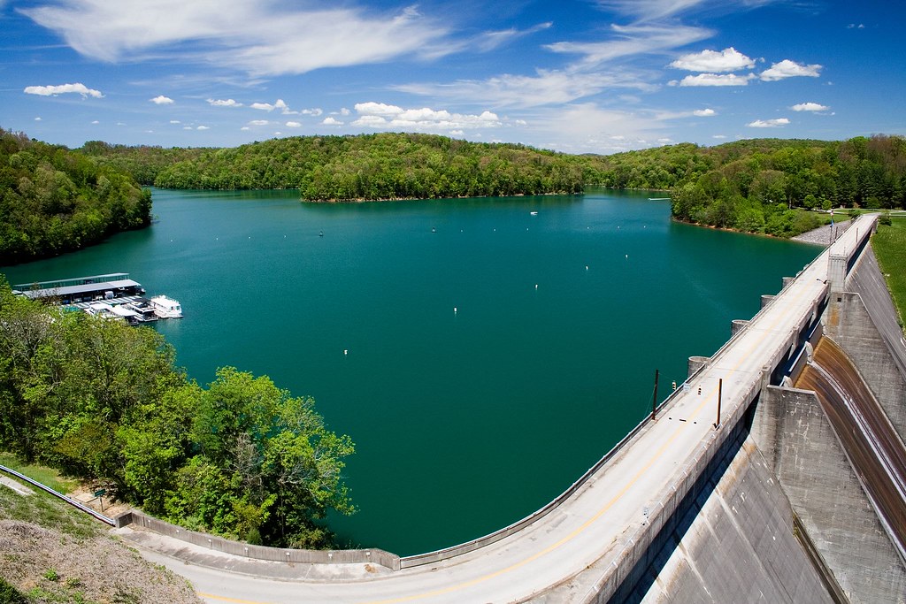
Spanning seven states and 24 dams, the development of the TVA was a massive project affecting millions of people. Not just a feat of engineering or America’s grandest planning effort, the TVA sought to bring economic development to one of the country’s poorest regions, through flood control and the generation of electricity.

The aims of TVA administrators and designers were equal parts heroic and problematic, globally aware and regionally sensitive, and these impulses bear themselves out architecturally -- in the unrepentant Modernism of dams themselves; the eclectic architecture of the thousands of homes required to house those displaced by the flooding of the Tennessee River’s bottomlands; and the graphic standards developed for all TVA materials. Steven Heller’s chapter on TVA graphics and Todd Smith’s chapter on the TVA’s visual art campaign are particularly compelling in their descriptions of the complex charge behind the aesthetics of such a massive undertaking. A look inside the TVA’s architects offices in Knoxville by Christine Macy illuminates a productive tension between local and global design considerations, while Jane Wolff’s discussion of the TVA’s transformation of the Tennessee Valley landscape underlines the fact that the land itself was intended to become, through clever manipulation, what would transform the region, physically and culturally:

[The TVA] reinvented the Tennessee Valley as a collection of idealized scenes—rustic, pastoral, and monumental. The places that the TVA created argued for its agenda. Meant to look as though they had always existed, they declared that progress was not at odds with tradition, that old images and new technologies could be integrated, and that history and geography were continuous and coherent. The agency’s terms for the landscape were so internally consistent and so convincing that its rhetoric was barely questioned.

Culvahouse points out that this wholescale approach to regional development was not without its flaws:

Of course, not everyone was convinced. The intricate weave of people’s lives in the landscape does not readily admit comprehensive visions or earthly utopias….Resentment of the TVA’s reengineering of the region lingers there. But just as certain are the benefits to the region, rich in new ways of intertwining our lives with the land.

The book is valuable reading for any design professional who thinks they can foresee the ramifications of any grand transformation, and is particularly apt in an age of new regional transformations from Dubai to Shanghai; grand civic schemes like the 2008 or 2012 Olympics; new parks from New York to Toronto to LA; and of course, the fervent, ongoing, perpetual search for more energy.

------------------


Big thanks to Chris Timmerman, the blogger behind Brand Avenue, for writing this guest post! Check out Chris' blog for more great insights on "place, space, and identity."

(Photo from Flickr user Robby Edwards. The original full-color version can be viewed by clicking the photo.)

Sunday, November 4, 2007

Maps: Finding Our Place In the World @ The Field Museum

About a fifth of the way through the Field Museum's Maps exhibit, I started to feel a bit giddy. As a long-time lover of maps, I'd been looking forward to this -- the centerpiece of Chicago's Festival of Maps -- for months, and it was clear early in my time at the exhibit that I knew that I would not be disappointed. Now, after having a day to reflect, I can honestly (and emphatically) say that Maps: Finding Our Place in the World is one of the most impressive museum exhibits I have ever attended.

Those are strong words, I know, so let that be my one burst of enthusiasm. Henceforth, I'll try to be as objective as possible...I'd hate to do that thing where I puff something up so much that it can't live up to my description. Not that I think it's possible to overstate -- oops, sorry. Almost gushed again.

Divided into seven sections, Maps begins by addressing what is probably the most common use of its subject matter: wayfinding. The content of this section is subdivided into two groups, the Itinerary (one route depicted) and the Network (many routes depicted together). The maps on display set the tone for the rest of the exhibit; there is a great variety of mediums, styles, and time periods represented. Highlights include a section of an ancient 60-foot Japanese scroll depicting the road from Kyoto to Edo (now Tokyo), a 1940s road map of America with road trip routes taken by an anonymous family highlighted and annotated, and an original print of Harry Beck's revolutionary redesign of the London Tube map.

The second section of the exhibit displays maps that give structure to the world. While many maps may not be used directly for getting from A to B, they help us to develop a concept of the vastness of the world around us. The exhibit charts the evolution of mankind's understanding of the planet through maps, showing how they were used to record progress and redefine the world as our knowledge grew. The undisputed centerpiece of this area is a set of two large (about 4 feet in diameter, but I'm guessing) wooden globes -- one that depicts the earth as it was believed by cartographers to look (curiosities include the island of California off of North America's west coast and the near-absence of Australia and New Zealand, though overall it's surprisingly accurate) and the other showing the celestial dome above, with full-color representations (i.e. a scorpion for Scorpio) of the constellations.

Maps are also used, as shown in the third and fourth sections of the exhibit, to show important places and "bear witness to and shape history," in the curators' words. These two collections expand quite nicely upon the logic of the first two; the most obvious uses of maps are to chart the world and the routes that people use to move around it, but with a heightened understanding of the larger world, it makes sense that people started using maps to break the larger world down into smaller parts. Privatization and land division become central foci here. Several important names pop up up in a subset of the fourth section focusing on historical maps of the US: Lewis and Clark's map of their route is here, as are land surveys by George Washington, Thomas Jefferson, Abraham Lincoln, and Benjamin Franklin.

Even more sophisticated maps make up the fifth section, which highlights maps that make the invisible visible. These are highly detailed creations that detail intangible or hidden details about places. One of Jane Adams Hull House's famous maps of Chicago blocks broken down (and color-coded) by ethnicity and income is on display (a print of the same map is included in the Chicago History Museum's Mapping Chicago exhibit). So is a huge, vividly-colored map of the geology of Great Britain, one of the first maps of its kind. Another first here is a small, unassuming map of northern Italy that is believed to be one of the first uses of shading to depict topography, pre-dating its common use in recent times by several centuries. A closer look at the plaque describing this piece reveals that its creator was none other than Leonardo da Vinci. Another of his quiet pieces, a plan to canal-ize the Arno, is nearby.

The sixth area is a showcase of maps that depict imaginary places. L. Frank Baum's map of Oz is here, along with several of J.R.R. Tolkien's hand-drawn maps of Middle Earth. This section contrasts nicely with the seventh, which shows maps in rather mundane use in everyday life. A RISK board, a needlepoint map of Great Britain, a kiosk showing mapping technology on modern cell phones -- these examples point out the many ways in which maps seep into our daily routines. This last section culminates in an interactive wall of video maps where you can touch cursors on large screens and navigate satellite imagery and zoom in on your hometown. (It can be a bit tricky to get these to work -- try holding your fingers a few centimeters away from the screen).

If there is one opportunity that is really missed here, it's that Maps does not spend any time on the way that the internet is currently democratizing the field of cartography. There is no mention of mashups or group maps or even Mapquest, the launch of which really was revolutionary moment for mapping technology (though Mapquest's prominence in online mapping has since been usurped by Google and Microsoft). In fact, I kept expecting to see this theme threaded throughout the other sections of the exhibit, but it never even made an appearance.

Overall, Maps: Finding Our Place in the World is a suitably rich and creamy center to the FoM's gourmet chocolate. It's an exhibit that keeps you moving, looking forward to the next map even before you've finished reading about the last. If you don't live in the area but you've been looking for a reason to visit Chicago, this exhibit would even make a good excuse to come. If you live within driving distance and have even a passing or newfound interest in cartography, you have no excuse not to make the trip.

IF YOU GO
Maps: Finding Our Place in the World is on display at the Field Museum until January 27th, 2008. The museum is open 9:00am-4:30pm, seven days a week; the entry fee for the museum and the special exhibit is $19 for adults, $14 for students and seniors, and $9 for children under 12.


Links:
Maps: Finding Our Place in the World (Field Museum of Natural History)

Monday, July 9, 2007

Review: Last Harvest by Witold Rybczynski


Witold Rybczynski, author of Home, A Clearing in the Distance, and (my favorite) City Life, has two new books out. Well, it's actually only one book, entitled Last Harvest: How a Cornfield Became New Daleville, but it feels like two. As is the case in several of his previous books, Rybczynski alternates between a narrative that acts as the backbone of the book and a series of intellectual asides that, together, form a sort of supportive history to said backbone story. Normally this works well, with the historical details serving to enrich the central story line, but in Last Harvest, the two are separated more severely than in previous books. In short, one is highly engrossing and the other is...not so much.

In Rybczynski's defense, it should be stated at the outset that not even F. Scott Fitzgerald could jazz up the topic: residential suburban development. For those who aren't terribly interested in real estate (or even just this decidedly un-glamorous side of it) the backbone narrative, which tracks the conversion of a piece of farmland in the town of Londonderry in exurban Philadelphia into what is alternately called a "neotraditional neighborhood" and a "traditional neighborhood development" (or TND), is a challenge. There is bureaucracy, there is endless compromise, there is an utter lack of desire on the part of the developer to create the kind of real design guidelines that supposedly make these types of subdivisions -- sorry, communities -- work. About halfway through the book Tim Cassidy, a landscape architect on the Londonderry planning commission, explains to the author: "In reality, anything [the developers] build probably will be mediocre. But if they shoot for mediocre, it will just be terrible!" Near the end, Cassidy explains his opinion of the now-under construction project: "I guess I would have to say it's probably what I expected, because I expected to be disappointed." My sentiments exactly.

Upon deciding to write a book about subdivision development, Rybczynski took a gamble. Had he started tracking a neotraditional development that wound up working, this part of the book might have been more interesting. (For evidence of this, one need look no further than the section of Last Harvest that deals with Vince Graham's Newpoint development in Beaufort, SC.) Unfortunately, he wound up with a dud. But the parts of Last Harvest that track the history of suburban development in the United States wind up not only overshadowing the narrative -- they relegate it to the role of a rather long case study. Indeed, these fascinating asides, collected together, could be sold as a separate book. In them, the author covers everything from the well-planned early garden suburbs (including Chestnut Hill in Philly, where he lives), to Frank Lloyd Wright's prescient Broadacre City plans and the way that the Levitt brothers (of Levittown fame) disseminated those ideas to the masses. The best is probably the section that rather successfully argues that the standard suburban ranch house represents one of the most radical architectural departures in American history. I wouldn't be lying if I told you that Rybczynski makes the history of suburbia almost fun to read.

But even here, there is a hitch. About a third of the way into Last Harvest, Rybczynski's generally objective and academic voice cracks. "For the first time in history," he writes, "urbanization does not mean concentration." This opinion, which rather sneakily passes for observation in the context of the chapter, sets a very subtly pro-exurban development tone for the book. Granted, this is obviously not an anti-exurb book. It was frustrating, nonetheless, to see the definition of urbanity undermined in such a way. Urbanization is a term that describes the process of making an environment urban. There is a reason that the sub- prefix is added to the term to describe the kind of sprawling, decentralized growth like that described in Long Harvest. A suburban environment is, by nature, less than urban. This is not a comment on quality (though many would argue otherwise), but quantity. Urbanization is intrinsically tied to concentration (of many things), and suggesting the contrary is Rybczynski's one misstep in his careful plotting-out of the evolution of the American suburb.

Suburbia is what it is. Long Harvest, then, does an excellent job of helping the reader to understand the suburb for what it is. While by no means arresting, Rybczynski's recounting of the many tedious details of the development and planning process for one small subdivision -- sorry, communi...oh, forget that -- is certainly enlightening for anyone who wants to understand why so many of today's suburban developments look the way they do. Even better, if you can look past some semantic flubbery, it provides a wonderfully engaging history of how they got to their current state. At the very least, that history will give any good urbanist something to chew on. And what else can you ask a good summer book to do?


Links:
Last Harvest: How a Cornfield Became New Daleville (Powells.com)

NewDaleville.com

Monday, June 25, 2007

Review: The City of the Future Exhibit


I mentioned in last week's edition of Weekend Reading that I'd be making my way down to the Museum of Science and Industry here in Chicago to see the City of the Future exhibit that displayed the winner (Chicago's own Urbanlab) and finalists from the History Channel's competition of the same name. Which I did.

I'm assuming, since this competition was centered around the US' three largest cities, that the exhibit will travel to New York and LA following its time at the MS&I (which ends on October 7th and features the finalist from each city and all of the Chicago entrants.) I have to rely on assumptions because it's next to impossible to find anything about the exhibit on the web -- it's not even mentioned on the museum's site, nor the History Channel-hosted site of the competition. While one might find such a lack of coverage to be a bit strange in an age of ubiquitous online publicity, I think that I have a pretty good idea as to why the exhibit is a bit quiet.

It is categorically awful.

I should start out by saying that I'm moderately idealistic about architecture- and planning-related exhibits, especially at publicly-funded museums like MS&I. I have this silly idea in my head that these exhibits should communicate the ideas they are intended to express in a way that can be comprehended by someone with absolutely no background in architecture or planning. I'm all caught up in the idea that museums are places for sparking dialog, for creating interest, for broadening horizons -- in other words, they're places of inspiration. I know, I know: how droll.

While the different competition entrants vary in the plausibility and originality of their ideas (checkered results are to be expected in a contest, after all, in order for there to be a winner) the true failure of this exhibit lies in its curatorial execution. The entry room plays a brief History Channel-produced video about the contest in which the people behind the finalists from all three cities (Urbanlab in Chicago, Eric Owen Moss in LA, and ARO in New York) talk about their proposals, and there is plenty of bland introductory text on the walls -- not to mention a few plugs for sponsors IBM and Infiniti. This setup fails to build much excitement (much less block noise from the corridor from flowing into the exhibit.)

Upon entering the main exhibit room just past the video kiosk, the visitor is greeted, to their right, by Garofalo Architects' competition entry. The model is a mildly interesting collection of images housed in plexiglass boxes, themselves organized into a skyline set in the familiar city grid. What this is supposed to represent, exactly, is lost to the casual museum-goer. The panel describing the entry is so vague that it could easily be mistaken for part of the generic ramblings in the antechamber. This, unfortunately, is more standard than stand-out. While Valerio DeWalt Train, Protostudio, and Dirk Denison Architects' proposals all wind up as focal points on the sheer strength of their creators' ability to communicate their ideas through their models and their own text, most of the other entrants fall short of accessibility due to an utter lack of adequate explanatory text. It is no secret that contemporary architecture favors the abstract when it comes to model-building; my annoyance with this fact aside, responsibility here fell to the curators to communicate the ideas behind the obtuse constructions on display. This was unfortunate.

The true mark of success for a public exhibit is the reaction of the people who are viewing it -- not in the sense of a positive reaction giving the subject merit or value, but in the sense of it provoking some kind of reaction, positive or negative. That being said, the general atmosphere at the City of the Future exhibit was that of confusion. The room was filled with people wandering about, utterly nonplussed. There were plenty of screaming children at the two tables of blocks that allowed the museum to deem the exhibit "interactive," but of the adults in the room I only heard a few speak. "So this is the city of the future, eh?" one asked. His partner responded, her disgust nearly palpable, "What is?"

This was easily the most disappointing aspect of the exhibit. Architecture and planning are both fields that are commonly viewed by the public as aloof and, often, as "the enemy." Planners scatter communities to replace beloved neighborhoods with stark and stale utopian visions. Architects are a major group within the artistic elite that cannot help but roll their eyes at the mere hint of a question about their brilliant design. These tropes, of course, are exaggerations (we hope.) Unfortunately, the opportunity provided by this exhibit for people within these fields to engage the public and generate excitement about the future has been totally lost. And that's a damn shame.

In the end, Urbanlab's proposal of a series of eco-boulevards that would "close Chicago's water loop" by allowing the city to recycle all of its wastewater was the clear and rightful winner of the competition. As was the case with Valerio DeWalt Train et al, Urbanlab's model and other visuals communicate enough about their ideas to actually be inspirational (though panels describing the winning concept again fall short of adding to the experience.) But in the murky sea of the City of the Future exhibit, this proposal looks even better by comparison. So while it does little to improve public opinion of or interest in planning, architecture, and the future of these fields, perhaps this exhibit is not, as I opined earlier, a total failure. Perhaps its accidental success is in its ability to highlight all the more brightly one truly brilliant concept.


Links:
The Museum of Science and Indusry

City of the Future (History Channel)

Weekend Reads (ArchitectureChicago Plus) (contains hard-to-find images of the Valerio DeWalt Train proposal.)

Urbanlab

Dispatches from a Post-Water Chicago (Pruned) (from whence I jacked the above image...I am not sure from whence they jacked it.)